Brownsville Wellness Coalition
2024 Farmer Olympics
Logo & Badge Design
Client: Port of Brownsville
Disciplines: Branding, Art Direction
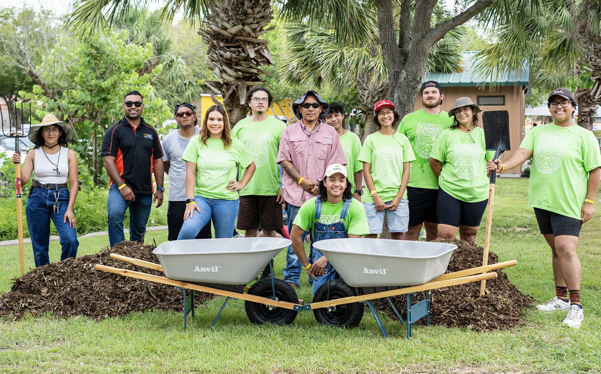
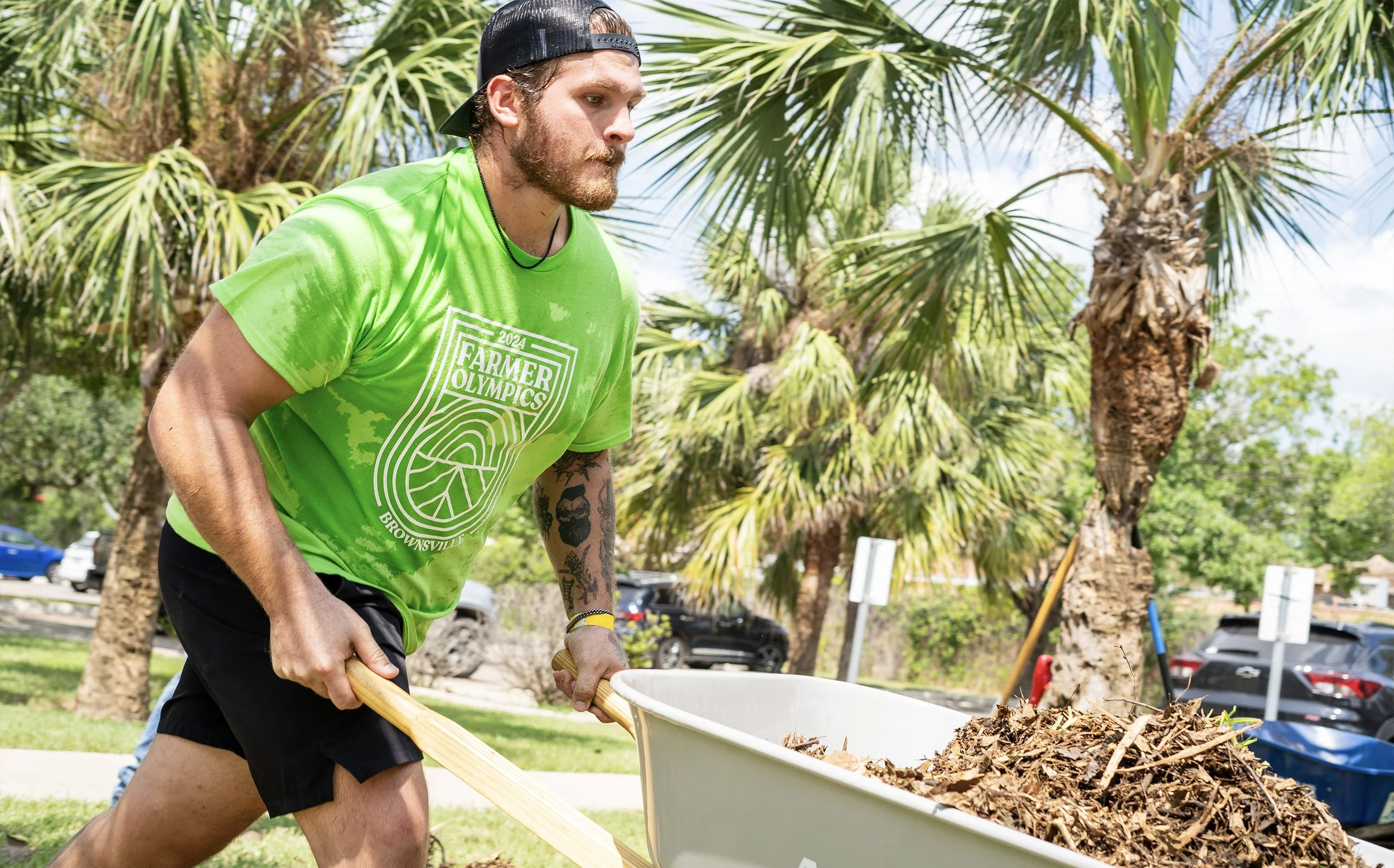
Community events are about more than gathering people in one place—they create shared moments that celebrate culture, health, and connection. For the inaugural Farmer Olympics hosted by the Brownsville Wellness Coalition, a visual identity and commemorative medal were designed to capture the spirit of friendly competition while highlighting the region’s strong connection to local agriculture.
The identity needed to work across event materials—from signage and promotion to the physical medals awarded during the games. The goal was to create a mark that felt playful, energetic, and rooted in the agricultural traditions that define the farmers market community.
Insight
Farmers markets are spaces where food, culture, and community intersect. The Farmer Olympics was designed to celebrate growers, vendors, and families who support local agriculture. The visual identity needed to reflect both the competitive excitement of the Olympics and the humble, hardworking spirit of farming.
Rather than creating a purely athletic aesthetic, the design embraced agricultural symbolism—turning familiar farming tools and crops into the visual language of sport.
Idea
The logo merges the recognizable structure of Olympic-style emblems with imagery inspired by agriculture. Produce, tools, and farming motifs were integrated into the mark to represent the diverse vendors and growers who make the Brownsville Farmers Market possible.
Circular forms and badge-style composition were used to evoke the feeling of an official sporting event, while still maintaining an approachable and community-centered tone. The mark celebrates the idea that farming itself is a daily act of endurance, teamwork, and dedication.
Execution
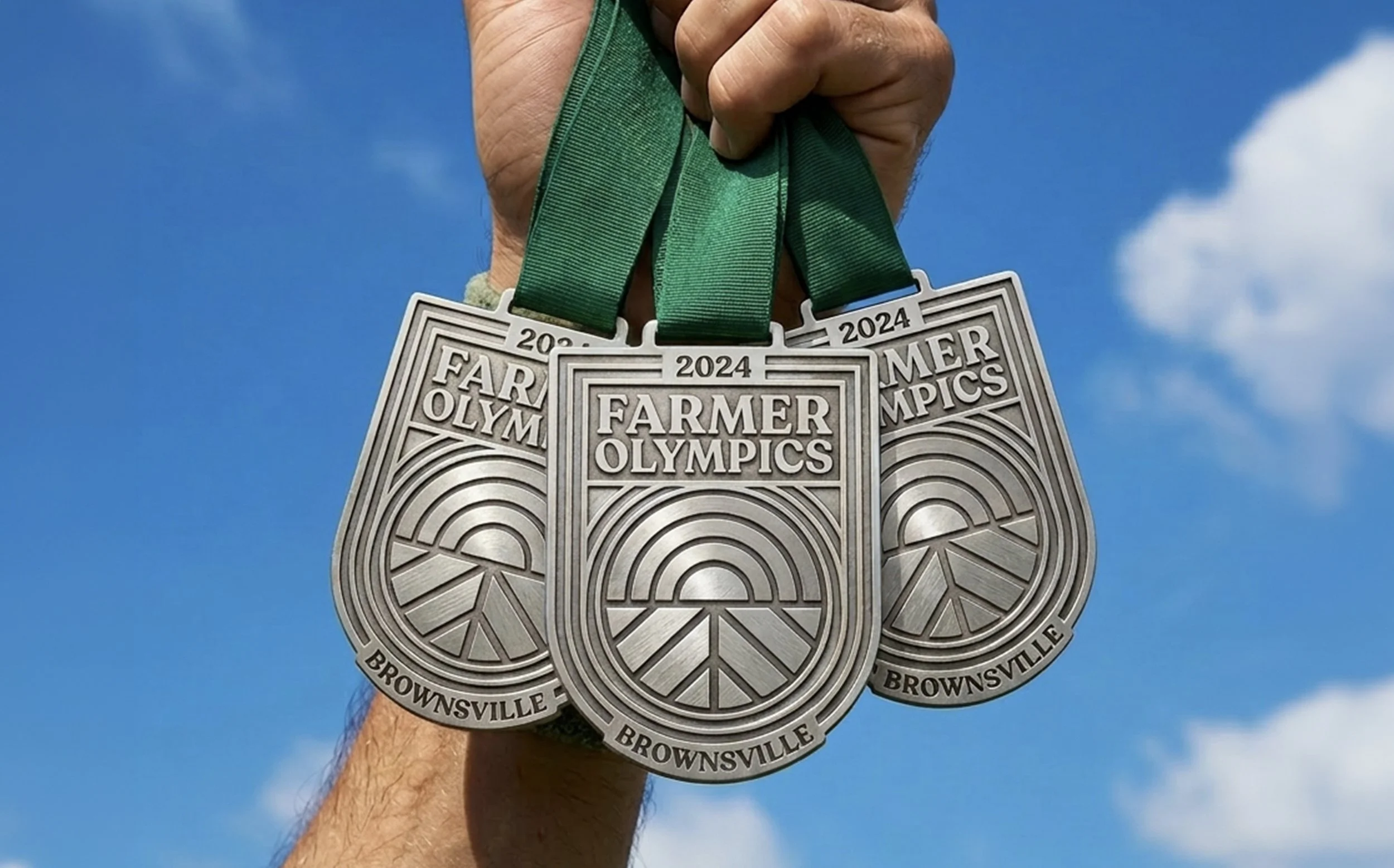
The identity was designed as a badge-style emblem, drawing inspiration from classic sporting insignias and agricultural fair graphics. The structured shield composition gives the event a sense of ceremony and legitimacy while remaining approachable for a community-centered competition.
At the core of the design is a rising sun above cultivated fields, symbolizing both the daily rhythm of farming and the spirit of growth that defines the Brownsville Farmers Market community. Radiating arcs represent sunlight and energy, while the geometric fields below subtly echo the lines of athletic tracks—visually connecting agriculture with the spirit of friendly competition.
The color palette reflects the landscape and vitality of the Rio Grande Valley. Vibrant greens represent farmland and harvest, while warm oranges and yellows evoke sunlight, warmth, and the energy of the event. Bold serif typography reinforces the heritage of agricultural competitions and fairgrounds while ensuring strong legibility across applications.
The circular core of the emblem was intentionally designed to function as a medallion within the badge, allowing the identity to translate seamlessly into a physical medal awarded to participants. Clean shapes, bold outlines, and simplified forms ensured the design could maintain clarity when engraved or produced in metal.
Outcome
The Farmer Olympics logo became a recognizable symbol of the event, helping establish a visual identity for the inaugural Brownsville Farmer Olympics at the Brownsville Farmers Market.
As both a logo and a commemorative medal, the design transformed the event into something participants could carry with them—serving as a tangible reminder of the celebration of agriculture, community, and friendly competition.
By combining imagery of farmland, sunrise, and Olympic-style badge structures, the identity positioned the Farmer Olympics as more than a one-day event. It became a symbol of the people who grow, sell, and support local food in Brownsville, reinforcing the spirit of collaboration and pride that defines the market community.